
Visual Identity for "Komunikační fitko"
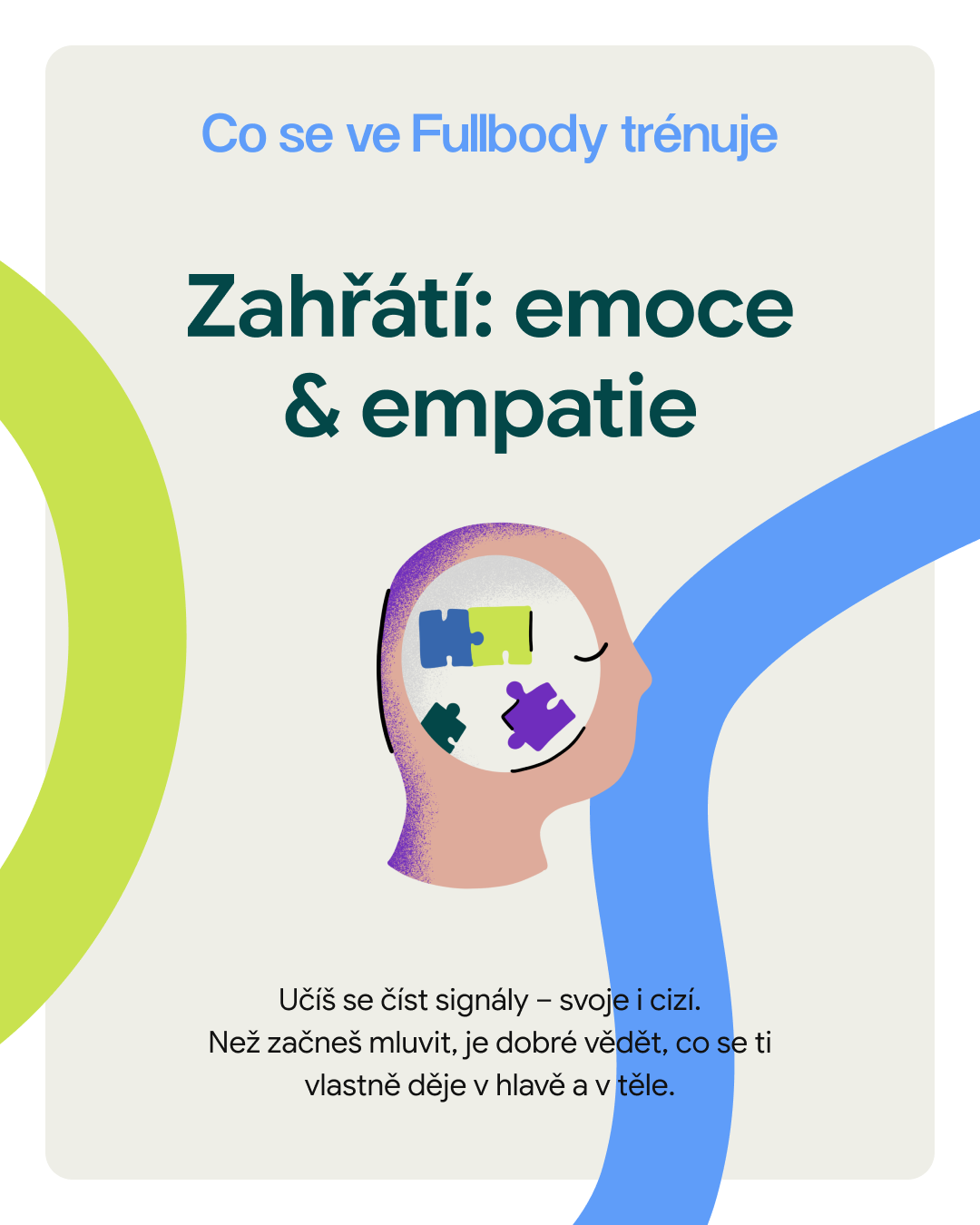
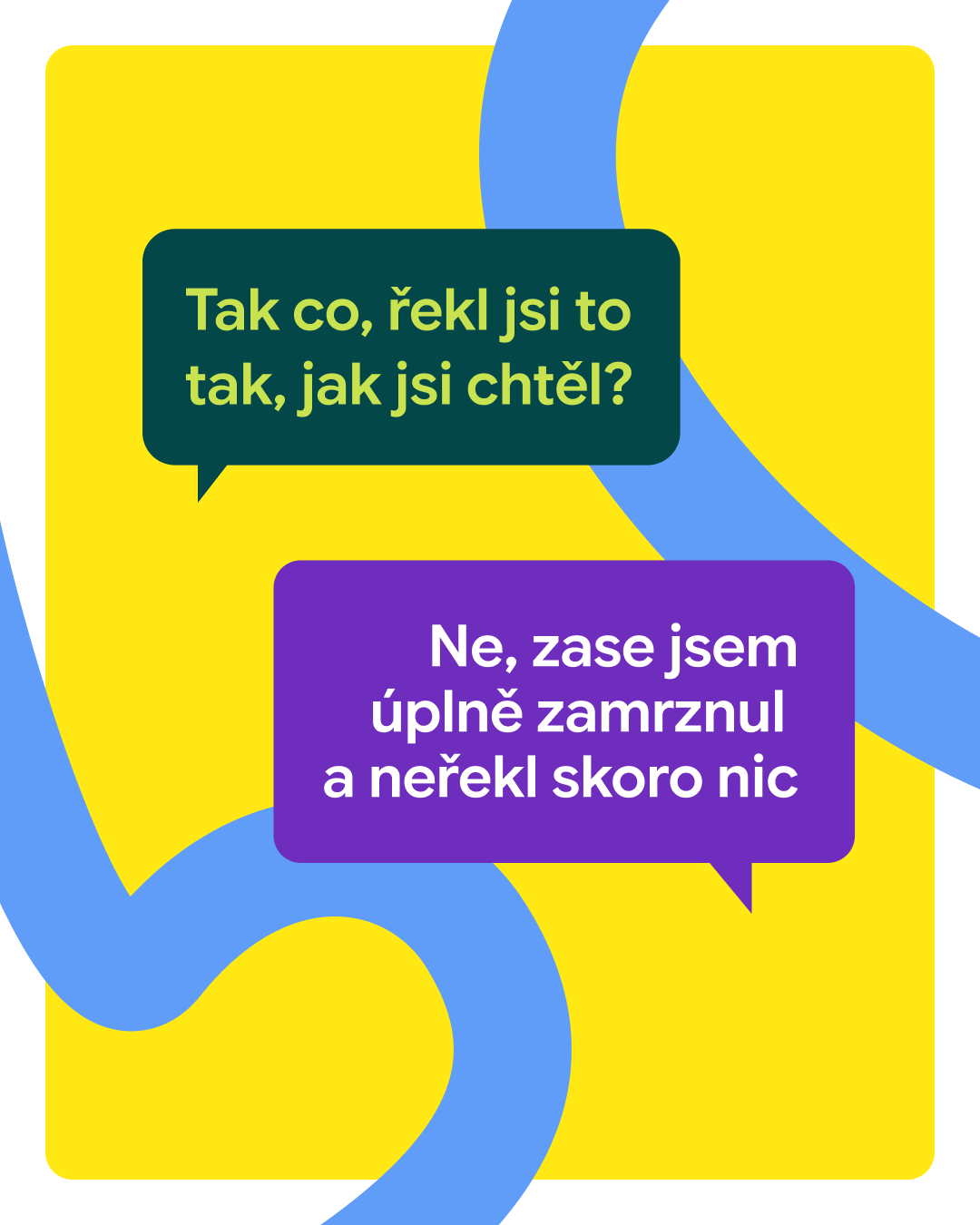
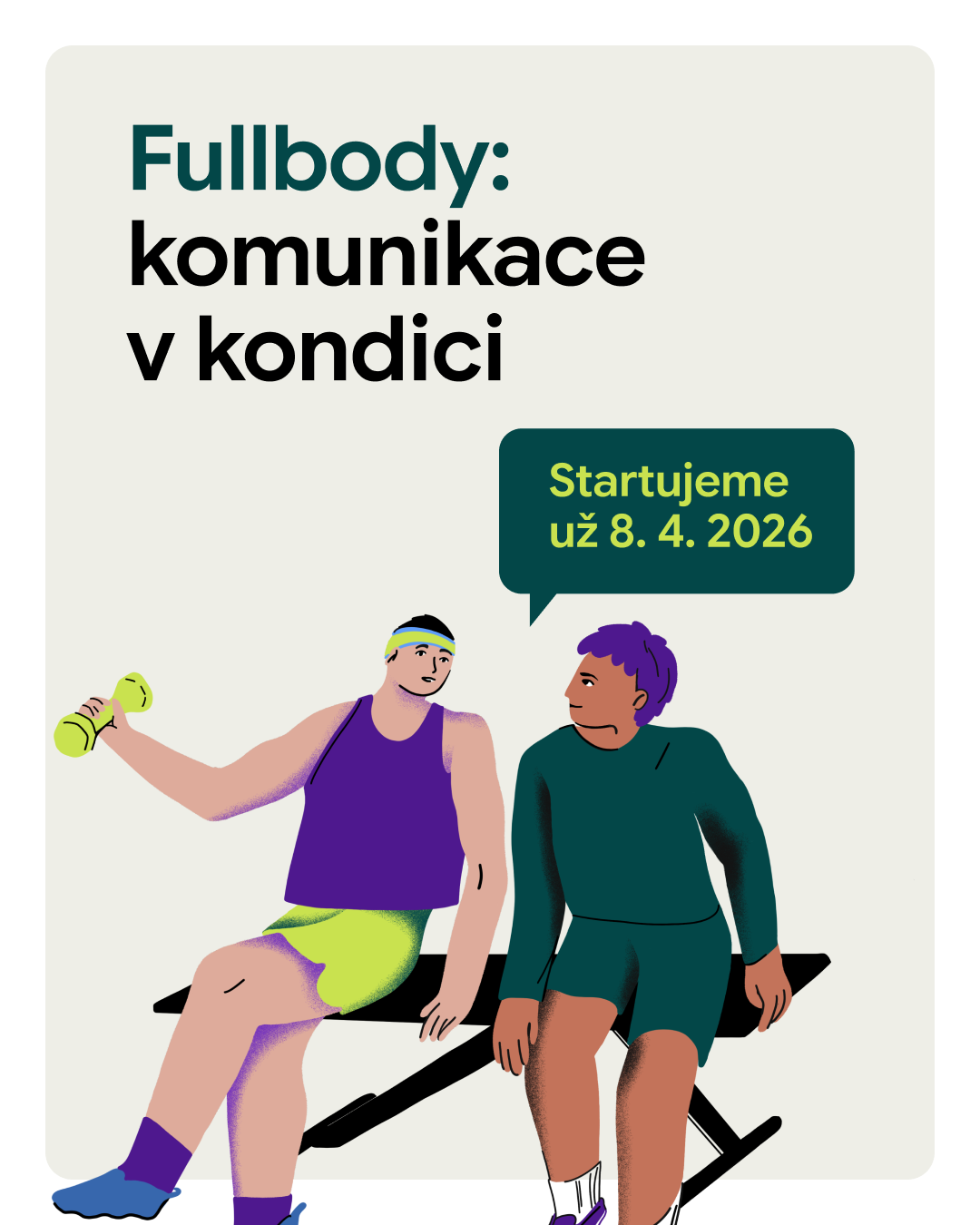
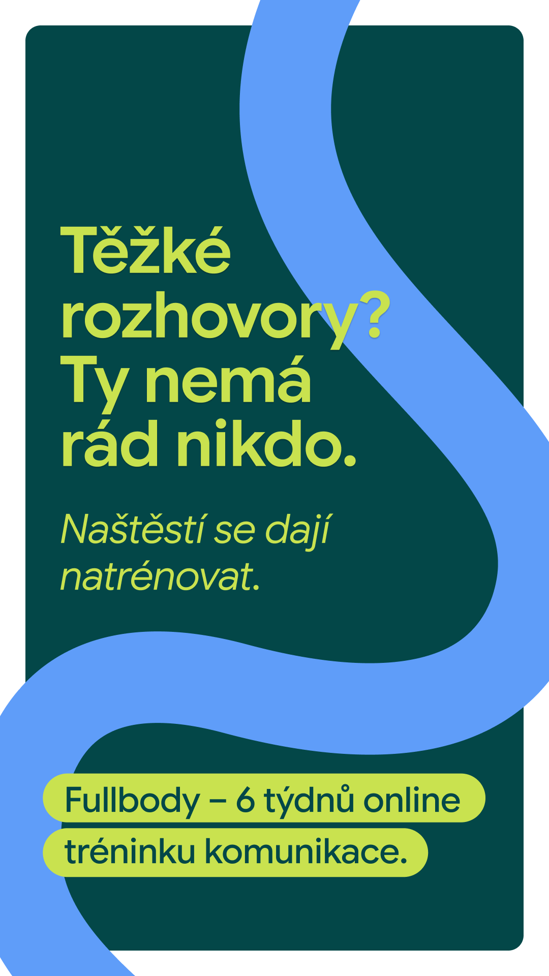
Visual identity and illustrations for the Komunikační fitko brand.
The project was created with the aim of helping people develop and train communication skills in a natural and accessible way, without unnecessary pressure. The brand identity directly follows this intention, supporting openness, authenticity, and the willingness to engage in dialogue without fear of making mistakes.
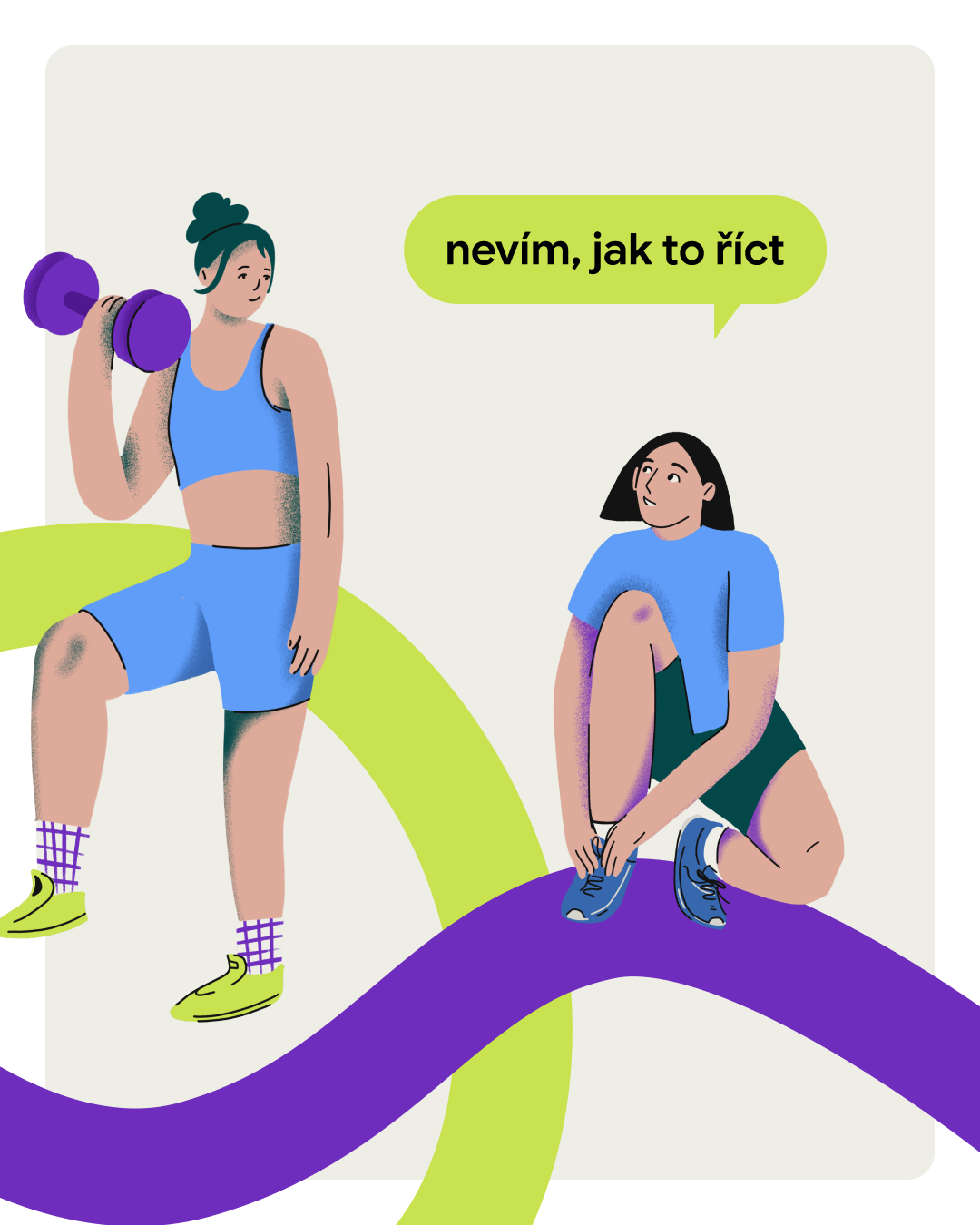
Playful colors and illustrations combined with a bold, clean logo clearly reflect the purpose of the entire project. The visual style is based on the idea that communication can be trained much like physical fitness: regularly, lightly, and with flexibility. While creating the illustrations, I worked with simple shapes, vivid colors, and a sense of exaggeration that gives the brand energy, memorability, and a friendly character.
Vizuální identita a ilustrace pro brand Komunikační fitko.
Projekt vznikl s cílem pomáhat lidem rozvíjet a trénovat komunikační dovednosti přirozenou a srozumitelnou formou, bez zbytečného tlaku. Na teto záměr navazuje také identita značky. Podporuje otevřenost, autenticitu a chuť zapojit se do dialogu bez obav z chyb.
Hravé barvy a ilustrace s úderným a čistým logem jasně odráží cíl celého projektu. Vizuální styl vychází z myšlenky, že komunikaci je možné trénovat podobně jako fyzickou kondici – pravidelně, s lehkostí a pružně. Při tvorbě ilustrací jsem pracovala s jednoduchými tvary, výraznou barevností a nadsázkou, které značce dodávají energii, zapamatovatelnost a přívětivý charakter.